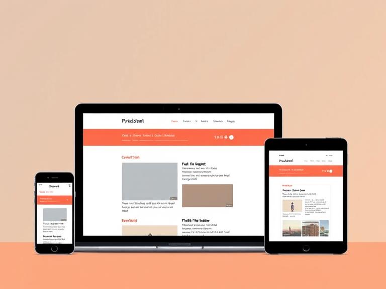
Responsive web design is the backbone of modern internet experiences. This course offers a step-by-step guide to creating websites that look and function beautifully on any device.
Students start by learning the structure of HTML5—how to use tags, organize content, and create semantic layouts. Then we move into CSS3, where learners explore styling techniques, animations, media queries, and responsive design principles. JavaScript rounds out the skill set, enabling interactivity like modals, sliders, form validation, and more.
The course is heavily project-based. Participants will build multiple websites, including portfolios, landing pages, and interactive single-page apps. They’ll also get introduced to version control with Git and deployment through platforms like GitHub Pages and Netlify.
This course is perfect for future web developers, freelancers, and creative professionals who want to bring their designs to life without relying on templates. By the end, you’ll have a portfolio of responsive websites and the confidence to take on real client work or advanced web development paths.
Leave a Reply